In the lead-up to this year’s WWDC, it was hard to predict what an update to visionOS would look like. After all, the initial version had only shipped four months earlier when Apple Vision Pro became available for purchase in the United States. Given how late in the software cycle visionOS 1 shipped, it was reasonable to wonder if there would be a visionOS 2 announced at all, and if so, how much it could realistically add to an operating system that had just debuted the previous quarter.
Of course, Apple’s software cycle waits for no one, so like watchOS before it, visionOS is receiving a 2.0 version rapidly on the heels of its initial release. But the shortened development window doesn’t mean that this update isn’t a significant one. I believe that the 2.0 moniker is well deserved based on the features and enhancements included in this release, especially given the quieter updates across all of Apple’s platforms this year in the wake of Apple Intelligence.
visionOS 2 moves spatial computing forward with an array of welcome quality-of-life improvements, deeper integration with some of Apple’s other platforms, additional tools for developers to create spatial experiences, system app updates in line with Apple’s other platforms, and a new way to experience photos that you have to see to believe. The combination of user experience refinements and new features makes for a solid update that Vision Pro users are definitely going to notice and enjoy.
Some of the changes we’ll dive into feel so obvious that you might wonder why they weren’t included in visionOS to begin with. Having used Vision Pro almost daily since it was released, I fully understand the sentiment. But then I remember that the iPhone didn’t gain the ability to copy and paste text until iPhone OS 3, and I’m reminded that developing new platforms takes time – even for a company as big as Apple.
So while some might seem basic, many of the changes included in visionOS 2 improve users’ experiences in significant ways every time they interact with the platform. The end result is a smoother, more intuitive operating system that will delight Vision Pro believers and, if Apple has its way, convince more skeptics to take the plunge into spatial computing.
Let’s jump into what visionOS 2 has to offer.
[table_of_contents]
Quality-of-Life Improvements
The biggest changes to visionOS this year are ones that many users won’t explicitly notice or that users of other Apple platforms take for granted. Individually, they might not even seem like that big of a deal. But taken together, these updates add up to a much improved user experience over that offered by visionOS 1. And it all starts with the way you navigate the operating system.
Navigation
Apple is known for creating interaction models so intuitive that they seem completely obvious in hindsight. Multitouch on iPhones and iPads is the most obvious example, but part of what makes all of Apple’s products so appealing is that they’re easy to pick up and use from the get-go. Creating the same effect for spatial computing, a paradigm that most people have no experience with, is a big challenge.
The company’s first attempt was admirable, but flawed. For this update, system navigation has been rethought to rely less on hardware and interactions borrowed from other platforms. Instead, visionOS 2 leans into the Vision Pro’s strengths, hand- and eye-tracking, to introduce whole new ways of interacting with the system.
First up: the Home View. Pressing the Digital Crown isn’t a bad way to open the Home View (and it’s still supported in this update), but it can get exhausting and annoying to perform the motion repeatedly when opening multiple apps at a time.1 What if there were a way to access the Home View without having to lift your arm at all? That’s exactly the thought behind an all-new gesture in visionOS 2.
No matter where your hand is within the view of Vision Pro, if you hold it open and look at your palm, a Home button will appear just above your hand. Press your fingers together to activate the button, and you’ll find yourself in the Home View, no arm-raising required.
The new Home View gesture.
There’s a lot to like about this new gesture. It may not be the most important detail, but I think it’s great that Apple carried over the Home button design from the original iPhone to visionOS – a nice little nod to the past in the company’s most futuristic device.
Mostly, though, I appreciate this gesture because it’s something completely new that takes advantage of what Vision Pro is best at. When you have a young platform with groundbreaking input methods, you should use them to their fullest extent, including in frequently performed actions like opening the Home View. The home gesture breaks from the past and embraces the fact that visionOS is something new.
It also, I think, qualifies as one of Apple’s trademark “so intuitive it’s obvious” interactions. The whole premise of visionOS is based on eye and hand controls. It’s natural to use your hand, which already performs tapping and scrolling gestures, to navigate the system, too. The act of turning my hand over, looking at it, and pinching my fingers together has become second nature to me – to the point that I do it without thinking or losing my flow. I can open the app I need and get back to what I was doing with minimal interruption, which is exactly what good navigation enables.
At the same time, old habits die hard. I still find myself sometimes pressing the Digital Crown to get to the Home View, too. There might come a day when Apple can remap that button to do something else, but it was smart not to change it this time around. Giving users both options is a good call; I think the new gesture will be the one to stick long-term, though.
The system’s gesture for accessing Control Center has been overhauled as well. In this case, the old method is nowhere to be seen, completely replaced by the new one. I say good riddance.
It’s understandable how visionOS developers landed on the idea of placing an upside-down caret above the user’s view to activate Control Center. After all, Control Center spawns from the top of the interface in most of Apple’s other operating systems. But in this case, the traditional model didn’t translate well. Accessing Control Center required users to roll their eyes upwards to activate a small caret icon and then tap on it. Somehow, the gesture was both too difficult to activate purposefully and too easy to activate accidentally.2 It needed to go.
The new Control Center gesture is an extension of the new home gesture. To activate it, you start by looking at your palm, but once the Home button appears, rather than pinching it, you turn your hand over so that its back is facing you. This will activate a delightful new piece of UI called the status bar. It looks like a widget and serves several purposes, the first of which is opening Control Center. Tap on it, and Control Center will appear, giving you access to system controls, notifications, Mac Virtual Display, and more.
Activating Control Center with the new gesture.
I find myself using Control Center a lot in visionOS. The typical interface for spatial computing consists of only your environment (whether physical or digital) and the windows and objects you’ve opened. There is no concept of a persistent status bar or menu bar like on other platforms, and visionOS doesn’t support widgets. Key information like the time, date, current focus, and your device’s battery life are all tucked away in Control Center alongside media playback controls, Wi-Fi settings, and even Spotlight. So it’s important that users have easy access to it, which is exactly what this new gesture ensures.
Like the Home View gesture, this new way of accessing Control Center fits naturally with the way visionOS works. It relies on the user’s hands and eyes without requiring any exaggerated eye or head movements, which could become fatiguing over time. I’m a big fan of the way this gesture has been implemented. I use it all the time and have never run into the reliability issues I had with the previous caret approach.
Sometimes, though, I don’t even have to complete the gesture to access the information or control that I’m looking for because visionOS 2 introduces a status bar that appears just before you tap to open Control Center. It includes the information users most often turn to Control Center for: the current time, device battery percentage, Wi-Fi status, Focus mode, and system volume. It also brings up a system volume slider when the user pinches and holds it, giving near-instant access to volume controls.
Isn’t this status bar just the cutest?
This is one of my favorite new features in the operating system this year. It’s an adorable UI, it offers a massive amount of useful information while staying out the way when it isn’t needed, and it just feels futuristic to activate and move around with my hand. It might seem like a small addition, but it’s one that users will benefit from every time they use Vision Pro, and that has a big impact over time. It’s also yet another sign of the platform maturing and embracing spatial computing as a paradigm rather than trying to shoehorn old methods into a new system.
Having volume control easily accessible also takes some burden off of the Digital Crown, which serves two functions when turned: adjusting the level of environmental immersion and turning the volume up and down. When making these adjustments, the system presents the user with two virtual dials: one for immersion and one for volume. By default, the Digital Crown controls immersion, but if the user directs their gaze to the volume dial, it will switch to controlling volume instead. I never liked this dual role; I felt like I could never point my eyes to the right place for controlling volume on the first try.
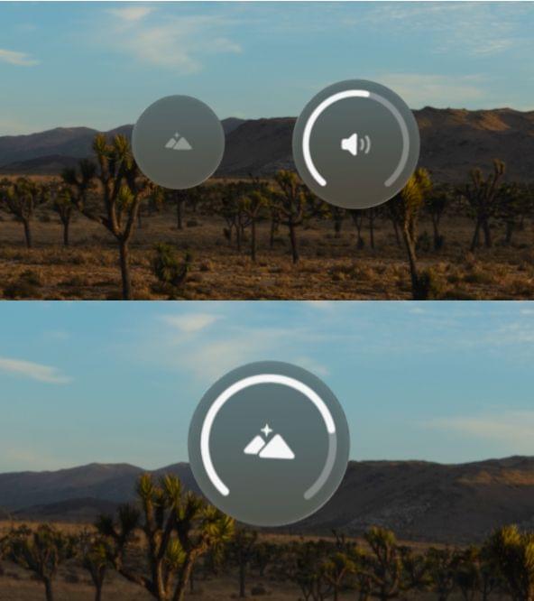
By default, a turn of the Digital Crown controls either immersion or volume (top), but the volume dial can be removed (bottom).
visionOS 2 offers a couple of ways to solve this. A new Digital Crown section in the Settings app includes the option to change the default focus from immersion to volume, which is great for users who want to change volume with the Digital Crown. My preferred approach, though, is to dedicate the Digital Crown wholly to controlling immersion while using the volume control built into the status bar. I accomplished this by toggling off ‘Use Digital Crown for Volume’ in the Sound settings. Now, adjusting immersion with the Digital Crown is more straightforward, and I still have quick access to volume controls in the software. It’s a win-win.
Home View Customization
It’s hard to believe, but Vision Pro shipped without the ability to rearrange app icons in the Home View. A selection of system apps were shown on the first page alongside the Compatible Apps folder, which contains all of the iPad apps installed on the system, and the rest of the apps in the Home View were simply arranged alphabetically. If a user had a favorite third-party app, iPad app, or non-prioritized system app that they wanted quick access to in the Home View, they were out of luck. There wasn’t any way to move them around.
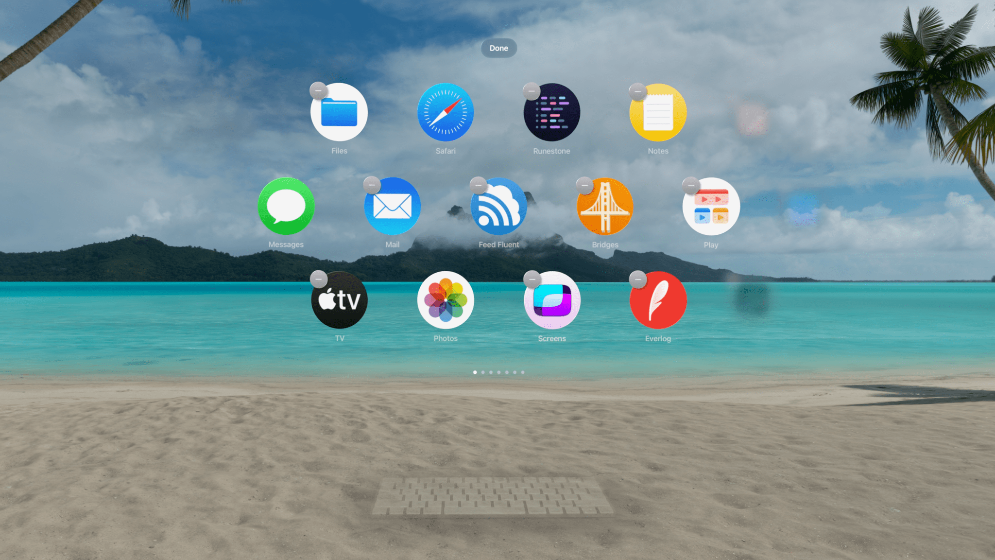
That’s all changed in visionOS 2. Now, users can arrange icons however they like, and iPad apps can even escape the Compatible Apps folder. This makes the Vision Pro Home View much more customizable and adaptable to users’ needs, but it does come with some limitations and quirks that are worth taking into account.
Rearranging app icons feels very familiar if you’ve ever used an iPhone or an iPad. Simply pinch and hold an icon, and the entire Home View UI will enter “jiggle mode,” with each icon wobbling slightly to let you know that it can be moved. You can then grab an icon and drop it wherever you want within the current page or hold it against the left or right edge of the view to scroll to another page and drop it there. If you add a new icon to a page that was previously full, the icon in the bottom right corner will move to the next page, causing subsequent icons to reflow. You can also delete an app in jiggle mode by selecting the ‘-‘ button attached to it.
Rearranging app icons in the Home View.
App icons cannot be freely placed in the Home View. Rather, icons begin at the top left of the view and fill in left-to-right until the row is full, and then a new row begins. Again, this is very much the way iPhone Home Screens worked until this year, except rather than a rectangular grid, visionOS app icons are arranged in a honeycomb pattern with a row of four icons followed by a row of five, then another row of four. Like iPhone Home Screens, pages in the visionOS Home View don’t have to be completely filled before the user is able to start a new page.
Rearranging icons in the Compatible Apps folder works a bit differently. When you pinch and hold an icon within the folder, a menu appears with three options:
- Add to Home View
- Edit Folder
- Delete App
The ‘Delete App’ option will remove the app from the device, naturally. ‘Edit Folder’ puts the Compatible Apps folder in jiggle mode, allowing you to rearrange icons within the folder. But to move an app out of the folder, you can’t simply drag it out while in jiggle mode. You have to pinch and hold it, then choose the ‘Add to Home View’ option. This will place it in the next available slot in the main Home View.
Adding an iPad app to the Home View.
iPad apps maintain their rounded rectangular shapes when added to the Home View, but the system adds a semi-transparent circle around the icons to make them blend in better with visionOS apps’ circular icons. While I find this sort of bubble effect cute, I do think it still looks out of place next to a full-size visionOS app icon, and I wonder if sticking to the plain rounded rectangle shape would have looked better.
Moving compatible apps out of the Home View and back into the Compatible Apps folder is even stranger than getting the icons out in the first place. To do so, you have to enter jiggle mode and then choose the ‘-‘ button attached to the app icon. That’s the button used to delete visionOS apps, but for iPad apps, it brings up a menu with two options: ‘Remove from Home View’ and ‘Delete.’ The ‘Remove from Home View’ option will move the icon back to the Compatible Apps folder, but it’s dangerously close to that ‘Delete’ button, so proceed with caution.
Speaking of folders, the Compatible Apps folder is the only one allowed in the visionOS Home View. Users can’t create custom folders of their own. If you try to hold an app icon over another one the way you would on an iPad to create a folder, the lower icon will simply move out of the way to make room for the one you’re dragging. visionOS apps can be arranged into pages but not folders, and only iPad apps can be tucked away in the single folder that exists. This is an odd omission and one I hope to see rectified soon.
With 13 apps per page and no way to organize apps into folders, the Home View can get out of hand pretty quickly. Pages start to pile up. On top of that, if you rearrange any icons, the system stops sorting apps alphabetically, so all future downloads are simply tacked on to the end of the last page. My Vision Pro currently has six pages of apps, and I’ve surrendered all but the first two pages to chaos. Anything beyond that just gets opened in Spotlight.
This system reminds me a lot of the iPhone Home Screen before the introduction of the App Library. Having access to my most-used apps at the beginning of the Home View is a game-changer, and it does remove a lot of friction when getting started on what I want to do. At the same time, I’m never going to take the time to organize most of the apps on my device. They’d be better off in a folder or just hidden away until I explicitly decide I want them in the Home View.
The changes to the Home View in visionOS 2 are a leap forward, but there’s another step that has to be taken. Users need folders – or better yet, a full-on App Library – to organize the majority of their apps so that the most important ones can take center stage within the Home View. Until that happens, I’d recommend you only bother with the first page or two and try not to think about the jumbled mess that lies beyond your tidy, custom Home View.
Beyond apps, the Home View also houses two other sections, People and Environments, which aren’t customizable. I personally find the People view unhelpful due to the fact that I can’t manually add contacts to it. The ability to favorite contacts that already appear in the view is nice, but its selection of people seems to be heavily influenced by my call history, which isn’t the best source of information on who I communicate with. If the People view was a customizable launcher for calling or messaging my favorite contacts, that might something I’d take a second look at; as it stands, I just wish visionOS included a full-fledged Contacts app.
Fancy a trip to Bora Bora?
The Environments view displays an expanding mini-portal into the destination option your eyes are currently focused on – a nice touch. And, of course, it includes the new visionOS 2-exclusive Bora Bora environment, a sunny beach getaway that I find so relaxing. I would like the option to move Bora Bora up to the top of my Environments list, but alas, it can’t be reordered. This is only a matter time, though. As Apple adds more environments (and hopefully opens up the option for third-party environments to be used systemwide), this list will have to be rethought with customization or, at the very least, some method of categorization.
Keyboard Awareness and Mouse Support
I’ve spilled quite a bit of ink3 extolling the power and fluidity of eye- and hand-tracking in visionOS, but let’s be honest: you need to connect peripherals if you’re going to do any productivity-related tasks on Vision Pro. Decades into its existence, the hardware keyboard still reigns supreme as the best input method for text longer than a sentence or two. A pointing device is less necessary given the accuracy of the device’s eye-tracking, but it still comes in handy sometimes. visionOS 2 brings new features for both input types.
On the keyboard side, this update introduces Keyboard Awareness. When you’re in an immersive environment, the system can now identify a Magic Keyboard or MacBook keyboard sitting in front of you and display it within your view. This is very similar to the People Awareness feature Apple touted when Vision Pro was first announced. The environment is still fully immersive, but it fades out around the keyboard to allow video from the outside world to pass through.
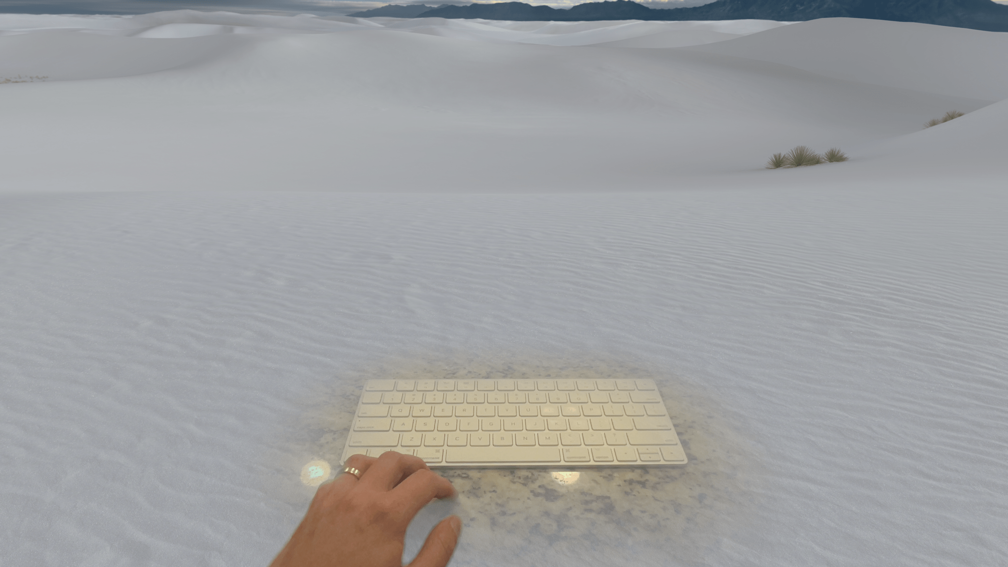
I can see my keyboard through all the white sand.
I’ve found this feature to be immensely useful when writing with Vision Pro. The built-in environments help me block out distractions around me and focus when I need to, but previously, I could only use them at about 50% immersion because I still needed to see the keyboard in front of me from time to time. Now, I can be fully immersed in whatever location I find most conductive to my work, and I can still look down at my keyboard if I lose my hand placement or need to find the location of a key.
It’s also one of the features that has come the longest way throughout the visionOS beta cycle. In the first version of the beta, the system sometimes struggled to identify my Magic Keyboard, especially under low light. Now, Keyboard Awareness works reliably, and in some conditions, it can even recognize my iPad’s Magic Keyboard, which isn’t an officially supported device. I hope this is a sign that the feature will be expanded to support third-party Bluetooth keyboards in the near future.
I’m not going to lie: it feels pretty cool to make the environment disappear like this.
As great as Keyboard Awareness is, it can also be a bit distracting to have the keyboard always present in my view even when I’m not typing. Thankfully, the new ‘Bring Hands Near to Reveal’ option found in the Awareness & Safety section of Settings can help with that. This setting disables keyboard passthrough until you reach your hands towards the keyboard to type. It’s quite a cool effect, and it gives you the best of both worlds: full immersion when you aren’t typing and Keyboard Awareness when you need it.
For those who want pointer control but don’t like using a trackpad, visionOS 2 introduces Bluetooth mouse support. Using a mouse in visionOS works very similarly to using a trackpad, and the same basic set of interactions are supported: clicking, dragging, scrolling, and secondary clicking. I’m surprised by the lack of special gesture support for the Magic Mouse (and even the Magic Trackpad), but I suppose it’s good that Apple isn’t giving its own peripherals special treatment in this area – at least not yet.
In my use cases, pointer control works well for text editing and working within individual apps, but I don’t find it all that intuitive for actually navigating the system. Hand gestures make more sense to me for opening apps, arranging windows, and adjusting system controls, but I’m glad that it’s possible to accomplish all of those things with a pointer for those who prefer it. Pointer control in visionOS is basic, but it gets the job done, and now it can even be done with a mouse.
Other Quality-of-Life Improvements
Hand-Tracking: The refresh rate for hand-tracking in visionOS 2 has been improved significantly. Previously, the user’s hand position was updated at a rate of 30 Hz, but it now matches the system’s current refresh rate, which is usually around 90 Hz. This three-fold increase results in smoother hand animations in video passthrough4 and tracking data that is much closer to real-time for developers. Developers can also optionally take advantage of new hand-tracking prediction in visionOS 2 to anticipate upcoming hand movements.
Reopen Apps After Restart: This new option (available in the General section of the Settings app) is the visionOS equivalent of the Mac’s ‘Reopen windows when logging back in’ feature. When the Vision Pro reboots, it will automatically respawn any windows that were left open before it powered down. Given the Vision Pro’s battery life restraints, system reboots are somewhat common, whether they occur while the device is in use or while it’s being stored. Either way, this feature allows users to hit the ground running after a reboot rather than being forced to recreate their setups from scratch.
Guest User: The operating system can now store eye and hand data for a single guest user for up to 30 days, allowing them to use the device multiple times over that period without the need to go through the setup process each time. This is a welcome change for Vision Pro owners who share their devices with others on occasion, but it still isn’t full multi-user support. It’s limited to only one guest user at a time, and data is removed after 30 days. I see this as more of an extended demo option than an actual solution for device sharing, a practice that Apple seems fundamentally opposed to.
Low-Light Performance: Vision Pro works best in well-lit environments. However, there are times when a user might need to use it in a dark space. Trying to do so with visionOS 1 resulted in a slew of warnings and repeated window respawns that could become frustrating quickly and dissuade users from trying to wear Vision Pro in non-ideal conditions. visionOS 2 makes this experience much more tenable. It still displays a warning when the device detects that it’s being used in low light and disables features like hand passthrough and window anchoring, but the system holds up better in low light, allowing me to actually use my computer in the dark. Imagine that!
Compatible App Appearance: Speaking of using Vision Pro in low light, one sure-fire way to overwhelm your eyeballs in visionOS 1 was to open an iPad app in a dark environment. Compatible apps always defaulted to light mode, which in many cases did not mix well with visionOS’s semi-transparent native aesthetic and contrasted somewhat painfully with a dark room or a virtual environment in dark mode. Thankfully, this update adds a new option in the device’s Appearance settings to switch the appearance of compatible apps to dark mode if you prefer. I made this change immediately after installing the first visionOS 2 beta and haven’t thought about going back since. iPad apps in dark mode just fit better with visionOS.
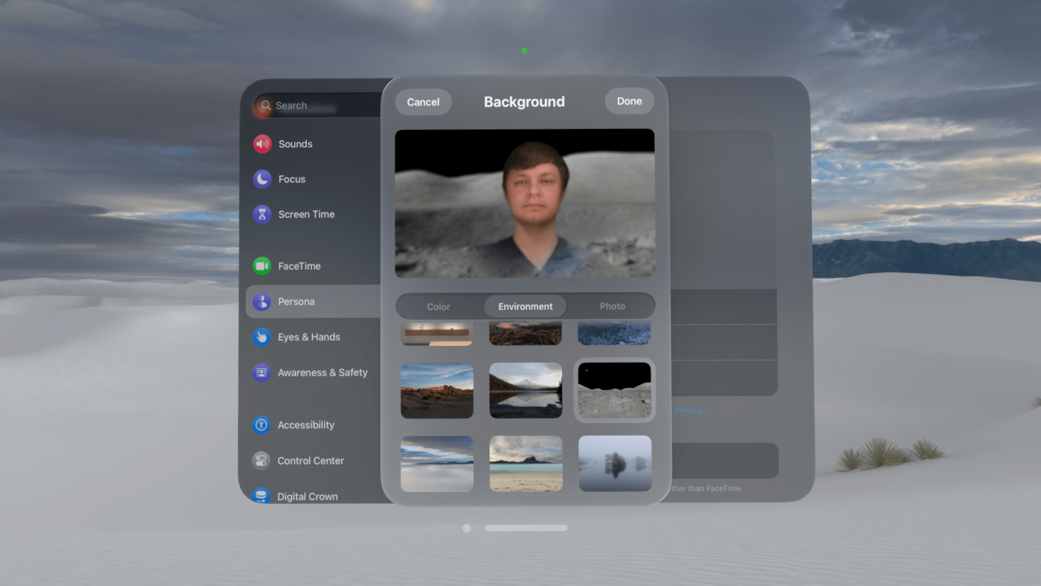
My persona is on the moon! But also in White Sands?
Persona Improvements: Apple continues to improve the accuracy of skin tones and clothing colors in Personas, users’ 3D avatars for video calls. The biggest difference I’ve noticed in Personas this year is better recreation of hand movements, likely due to improved hand-tracking system-wide. Users can also now set backgrounds for their Personas while in video calls. There are system-provided options for color backgrounds and backgrounds based on visionOS environments, or users can choose custom backgrounds from their photo libraries.
Train Support: Travel mode now supports trains in addition to planes, a feature I have been unable to test due to the disappointing lack of public transit in my area. Regardless, the ability to use Vision Pro on a moving train is a nice addition I hope I’ll be able to take advantage of someday.
The fact that such a large portion of this review is dedicated to covering these everyday quality-of-life improvements speaks to two things: the nascent nature of spatial computing and the reality that even the foundations of visionOS are still not totally settled. Vision Pro is an entry point into a whole new world for Apple, and early adopters are tagging along. I wouldn’t be surprised to see even some of the details covered above change in future versions of visionOS as the company continues to understand best practices for building a spatial computing platform for the masses. For now, these are big enhancements over what we saw in visionOS 1, and I’m thrilled by the difference they make in day-to-day use.
AirPlay Receiver
It’s been clear from the moment Vision Pro was announced that Apple envisions it as being one of several devices from the company in a user’s life. No feature demonstrates that more than Mac Virtual Display. The ability to mirror and control a nearby Mac from visionOS helps fill gaps in third-party software support for the device and offers Mac lovers one more reason to give Vision Pro a try.
Mac Virtual Display is poised to receive a major upgrade later this year in the form of a panoramic view that’s equivalent to two 4K displays side-by-side, but that feature hasn’t been made available for testing yet. Instead, visionOS 2 adds integration with two other devices, iPhone and iPad, in the form of AirPlay Receiver.
If you’ve ever used AirPlay to mirror your device’s screen to a TV before, the process will be very familiar. The first step is to enable AirPlay Receiver in the Vision Pro’s Settings app under General → AirPlay & Continuity. Then, you can activate the Screen Mirroring feature in Control Center on your iPhone or iPad and choose Vision Pro as the output. A frameless replication of the screen will then appear at the center of your view in a window that can be moved and resized like any regular visionOS app window.
Activating AirPlay Receiver from my iPad Pro.
AirPlay Receiver seems to only work for full-on screen mirroring, not for streaming specific content from your device to Vision Pro. The only app I’ve found that does support sending content via AirPlay to Vision Pro is the Photos app, which will allow you to stream a photo memory to Vision Pro, though it oddly lists the device as an Apple TV. I’m honestly not sure whether AirPlay Receiver is meant to be limited to screen mirroring or not, but in its current version, it functionally is.
However, the AirPlay Receiver window in visionOS can function as an external display rather than a 1:1 screen mirror under certain conditions. For example, when you open a picture or video in the Photos app on iPhone, the mirrored screen on Vision Pro morphs into a 16:9 window that features only the selected content with no UI chrome around it. And when you start a Keynote presentation on your iPad, the window will adapt to show your presentation in full view while your iPad shows a presenter view with notes and presentation controls. The AirPlay implementation in visionOS 2 isn’t quite feature complete, but as long as you start with screen mirroring, you can eventually use AirPlay’s other features as well.
AirPlay Receiver morphing into a full video preview.
There are a few major differences between AirPlay Receiver and Mac Virtual Display. First of all, AirPlay mirroring can only be initiated on the source device, not Vision Pro. This means that, in order to set up AirPlay Receiver, you have to be wearing Vision Pro and then operate your iPhone or iPad via Vision Pro’s passthrough video, a task that can be tricky depending on how clearly you’re able to see your real-world device in passthrough mode. This certainly isn’t as straightforward as starting the process from visionOS, which is an option for Mac Virtual Display.
Secondly, audio from the source device does pass through to Vision Pro when using AirPlay Receiver. Anyone who’s used Mac Virtual Display and been shocked to hear audio coming from their MacBook speakers several feet away will attest that this is a useful feature. It only makes sense that if your device’s screen is being mirrored on Vision Pro, its audio should be mirrored there as well.
Finally, the iPhone or iPad that is mirroring its screen cannot be controlled by peripherals paired to Vision Pro. Whereas Mac Virtual Display allows you to share Vision Pro’s keyboard and pointing device with the Mac being mirrored Universal Control-style, AirPlay Receiver is a one-way street. It can only receive information, not send any back to the source device. This means that you’ll have to control your iPhone or iPad either via touch input or a separate set of peripherals when using AirPlay Receiver.
While this feature isn’t as robust as Mac Virtual Display, I still think it’s a great addition to visionOS. It helps solve the same problem as Mac Virtual Display, namely that a lot of apps simply aren’t available on the platform yet. If you have a favorite productivity tool, reading app, or streaming service that you’d like to use in a spatial computing environment but isn’t available on the visionOS App Store, you previously had to rely on the web as a fallback or use an app like Bezel. Now, you can simply run your preferred app on another device and beam it to Vision Pro natively.
And the quality of the mirroring is remarkable. It’s clear and high-quality, with crisp text and almost no discernible latency. Animations aren’t quite as smooth as they are on the device’s actual display, but they are being relayed over a wireless signal, after all. I’m quite impressed with how smooth the experience of using AirPlay Receiver is.
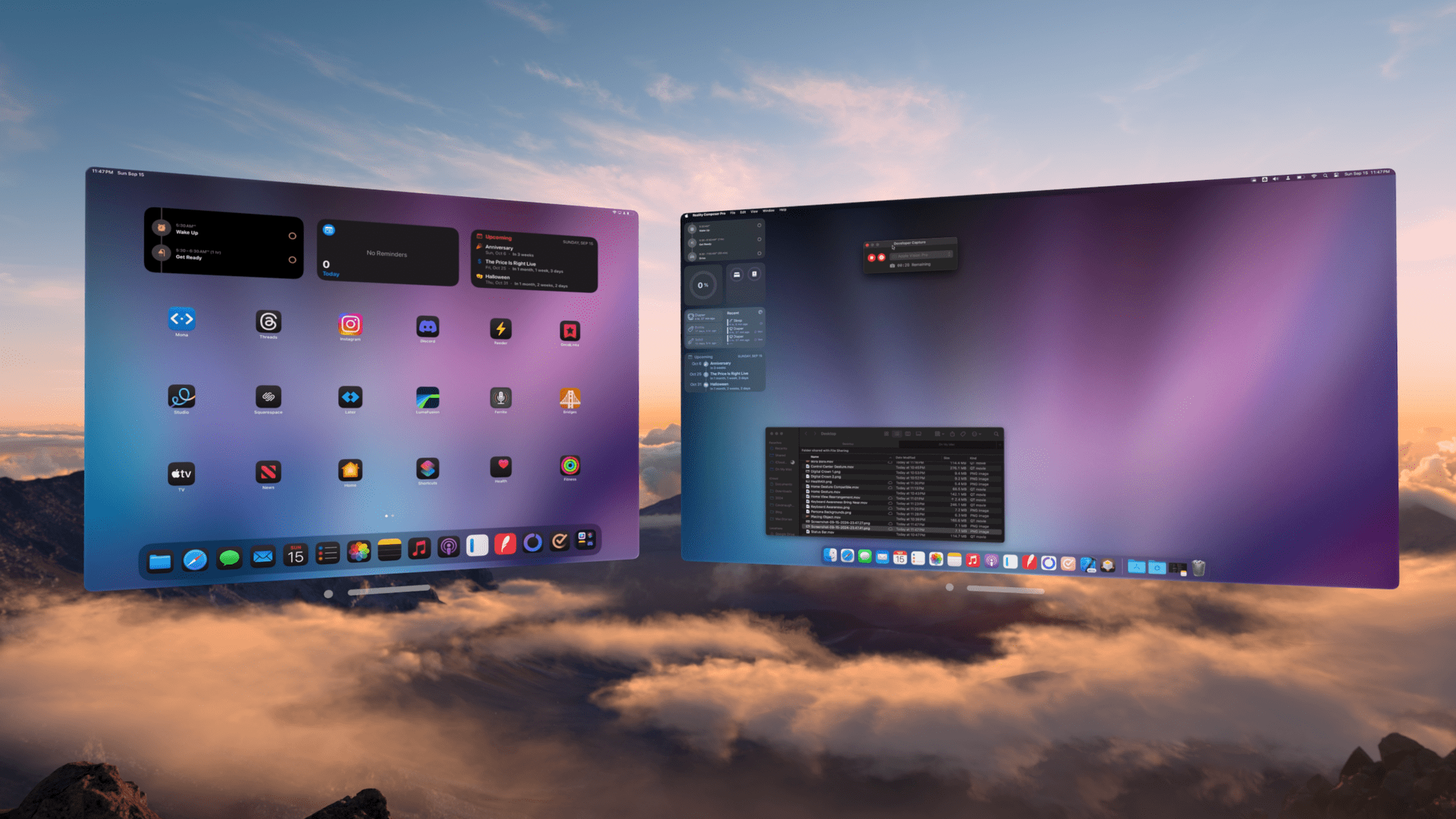
This almost feels like too much power to have all at once.
It’s worth nothing that AirPlay Receiver can only be used with a single source device at a time. If you’re AirPlaying from your phone to Vision Pro, you can’t also bring your iPad into the mix; you’ll have to turn off mirroring on one device before you enable it on another. However, it is possible to use AirPlay Receiver and Mac Virtual Display simultaneously. You can lock your iPhone or iPad while mirroring it to Vision Pro, and mirroring will temporarily pause without terminating the connection. When you unlock the device, mirroring will resume automatically.
I’ve personally found this feature most useful when mirroring my iPad Pro in the Magic Keyboard case. Trying to navigate my iPhone or iPad mini via touch while looking up at a mirrored display on Vision Pro just isn’t natural enough for day-to-day use in my book, though I appreciate that I have the option if I ever need it. But with the Magic Keyboard’s trackpad and hardware keyboard in play, AirPlaying my iPad Pro to Vision Pro has proved quite useful.
In fact, this very review was written on my iPad Pro while it was being mirrored to Vision Pro via AirPlay Receiver. My favorite tool for long-form writing is iA Writer, an app that isn’t available on Vision Pro even in iPad compatibility mode. In order to write in my app of choice, I’ve relied on AirPlay Receiver throughout the writing process, and it’s been excellent. It offers me the best of both worlds: I can use the non-visionOS app I need (on a virtual display much larger than my iPad’s, no less) in combination with environments and a bunch of visionOS app windows displaying my notes, resources, and more.
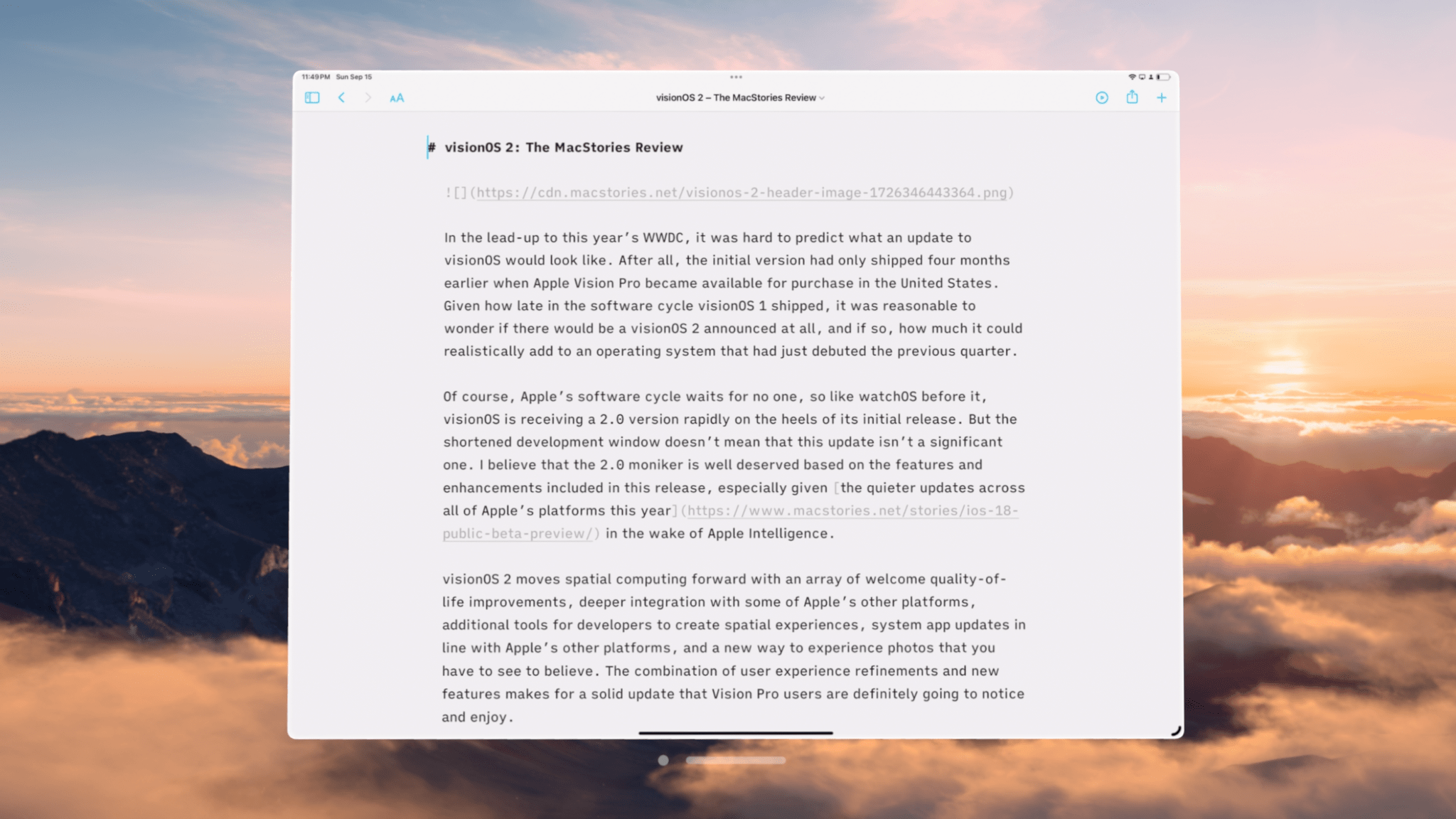
My view when writing this review.
That said, I do wish this integration between Vision Pro, iPhone, and iPad could be taken a bit further and borrow a couple of features from the Mac integration. Being able to start Mac Virtual Display from Vision Pro and control the connected Mac with the peripherals I’m already using makes for a much simpler setup process than AirPlay Receiver. Don’t get me wrong; I’m a big fan of the feature. I’m just such a big fan that I’d love to see it evolve into iPad Virtual Display and iPhone Virtual Display down the road.
Will that evolution ever come? It’s impossible to tell. But I would have never predicted that AirPlay Receiver would be as high-quality and handy as it is, so there’s certainly hope. Either way, tighter integration between Vision Pro, iPhone, and iPad is a win for Vision Pro owners who use other Apple products, and I’m happy to see it.
Photos
While the Photos app for iPhone and iPad was completely rethought this year, Photos for visionOS incorporates the latest features in line with Apple’s other platforms while remaining mostly the same in its design. The Library tab continues to display all of your photos and videos5, while the new Collections tab now houses albums, memories, media types, utilities, and new features like Recent Days and Featured Spatial Photos. The continued use of a tabbed interface rather than a unified one brings Photos for visionOS more in line with the Mac than the iPhone or iPad.
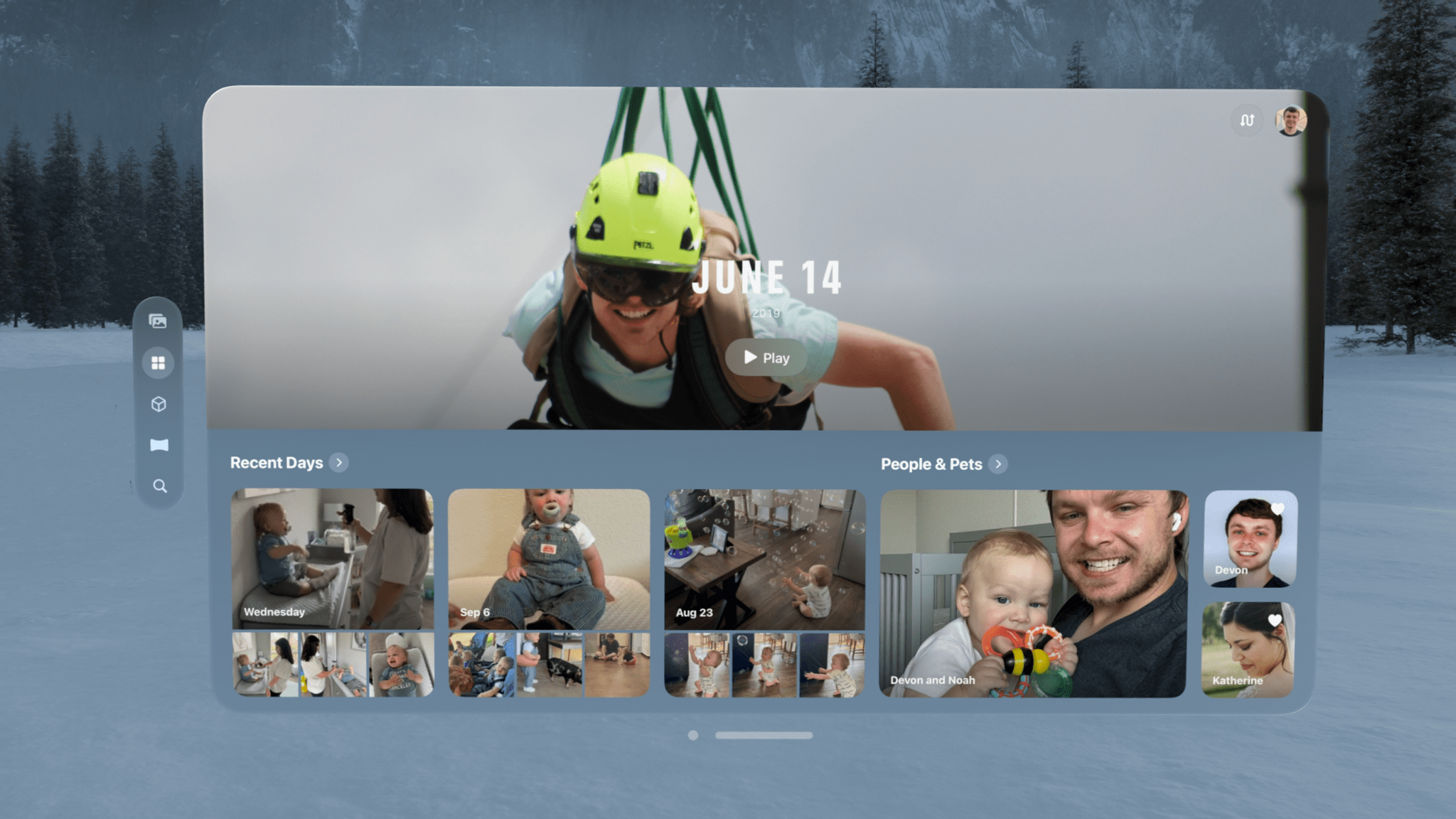
The new Collections tab in the Photos app.
The Collections tab is a fascinating addition, especially in its customizability. Pinching the customize button in the top right corner of the app opens up a screen that allows you to enable, disable, and rearrange sections freely. You can literally make the Collections tab whatever you want it to be, which is an amazing feature for an app as personal and as central to people’s digital lives as Photos.
Customizing the Collections tab.
It’s a lot of fun moving around elements within the Collections tab to get them just the way you want. But what’s even more fun is diving into its various sections to rediscover pictures and relive memories. Federico has more details in his review of iOS 18, but the new Recent Days feature is a great way to look back at photos I’ve captured recently, and it does a good job of highlighting the ones I want to see most.
While the Collections tab is excellent, it’s also an experience you can get on other Apple devices. What you can’t experience anywhere else, though, is spatial content, and visionOS 2 introduces the ability to turn your regular photos into three-dimensional spatial photos with the press of a button.
Converting a spatial photo. Just look at that animation
When I saw this demonstrated in Apple’s WWDC keynote in June, I immediately thought, “There’s no way this feature works that well on regular people’s pictures.” The company’s photography demos have always been idealized in order to show off features in the best possible light. I couldn’t imagine that spatializing photos would be something I’d actually want to do as more than just a gimmick.
Wow, was I wrong.
From the first moment I tried this feature for myself, I could tell that Apple was onto something very special. It literally is as easy as the demo makes it seem: open a photo, select the cube button in the upper left corner, and wait a moment for the system to process the image. After a short, eye-catching animation, you’re presented with a 3D version of your photo that, in a lot of cases, is downright breathtaking.
It’s difficult to describe and impossible to replicate on a two-dimensional screen, but something about seeing my personal photos – some of which I’ve looked at dozens or hundreds of times before – translated into 3D makes the experience of viewing them more impactful. Spatialized photos feel less like pictures and more like memories. I know that sounds ridiculous, but it’s true.
What sets spatial photos apart from regular ones is depth. With its dual displays, Vision Pro is capable of displaying 3D content in a way that makes your mind truly believe that elements are reaching out towards you. Whereas depth in 2D images is implied through composition and focus, with spatial photos, depth can literally be experienced.
It doesn’t translate to two-dimensional video, but shifting your perspective when looking at a spatial photo gives an impression of true depth.
The depth of a spatial photo makes it feel more real, like you’re looking through a window into the actual world rather than at a screen. Spatial photos are also dynamic, shifting the point of view in response to head movements and window placement. Shift your head to the left, and the entire scene changes slightly to give the impression that you’re looking at it from an angle. Move the photo closer to you, and the subject appears as if standing behind a window you’re looking through. Move it further away, and you’ll reach a point where the subject breaks through the threshold of the window and is now popping out at you. And for a full-on immersive effect, the panorama option blows up the image to a larger-than-life size that takes up your full view and fades seamlessly at the edges into your surroundings, giving it a dream-like quality.
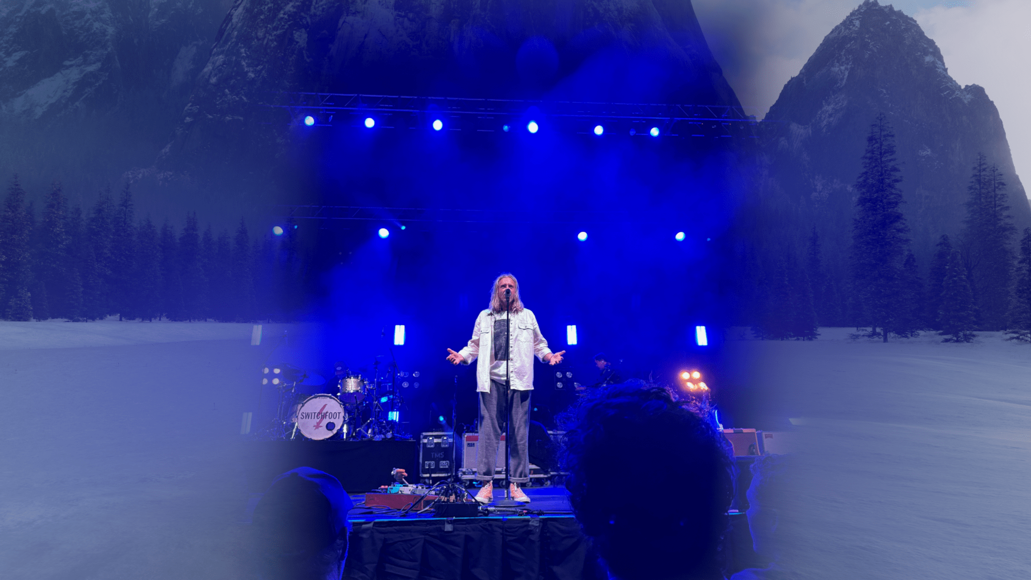
A spatial photo in panorama view.
Taken together, these elements of spatial photos leave you feeling like you’re no longer looking at a photo on a headset but actually reliving the moment the picture was taken.
I’ve spent hours converting all kinds of pictures into spatial photos: wedding pictures, newborn photos of my son, vacation shots, memories of loved ones who are no longer with us. Viewing these spatial photos is a significantly different experience than looking at them on my phone or even my TV. It’s more personal, more immersive, and more emotional – all things that I’m looking for when I dive into my photo library for a trip down memory lane.
I can’t say for certain that this feature will sell Vision Pros, but I would not be surprised to hear of people who buy the device for this purpose alone. It really is that good. If you love looking at pictures in your photo library and reminiscing, I highly recommend booking a Vision Pro demo and converting some of your own photos to see what it’s like. It’s not easy to put into words, but it’s an experience that’s won me over, and I think it will many others, too.
Feelings aside, spatial photos are also impressive from a technical level. The conversion is performed by a machine learning model that does not depend on depth data being built into the photo. In fact, I’ve thrown pictures at it that I knew for a fact included no depth information at all, and they converted to spatial photos just as well as portrait images shot on my iPhone. The model analyzes the contents of the photo and figures out how different elements relate to one another spatially, and then it applies that depth data to the photo to create an 3D image.

I wish I had a way to share the experience of seeing this photo in all its spatial glory with you. Want to come over and try out Guest Mode?
The conversion is able to capture real-world depth incredibly well. One particular example of this is a picture from my son’s newborn photoshoot. The picture was taken from inside of his crib, with him lying on the mattress and my wife and I standing over the crib looking in. The machine learning model was able to perfectly ascertain the angle of the railing and present its depth in a way that it feels like you’re inside the crib when you look at the photo. I’m amazed at how well it’s able to nail this sort of thing.
Of course, there are instances where the conversion trips up. As with Portrait mode on the iPhone, hair can be a tricky element for the model to separate from the background. In certain instances where elements overlap, the model can misinterpret the distance between them, creating an effect that’s entertaining but not realistic. Reflective and transparent surfaces don’t translate well. And there are certain one-off photos that, for one reason or another, just don’t mesh with the spatial conversion process. It isn’t perfect, but it has way more hits than misses in my experience.
Spatial photo conversion offers a truly wonderful way to re-experience pictures from the past, and I’m a huge fan of it. At the same time, I’d love the ability to take spatial photos myself so that I can capture real-world depth and then view it later rather than relying on an algorithm. That’s why I’m so excited that in a matter of days, I’ll have a spatial photo camera with me everywhere I go in the form of the iPhone 16 Pro Max. In fact, every device in the iPhone 16 lineup is able to capture spatial photos, and the latest iOS 18.1 beta even brings this capability to the iPhone 15 Pro and Pro Max. This is great because it allows current Vision Pro owners to experience even more of their memories as spatial photos and gives every iPhone user the chance to start building their spatial photo libraries now. Spatial photos: they’re here to stay.
The biggest downside of spatial photos, though, is the fact that they can’t be easily shared with other people – at least, not in their full three-dimensional glory. If I want to show someone else a picture that I love, I have to switch my Vision Pro into guest mode and walk them through the setup process first. That’s not something I’m going to do often, and it speaks to the solitary nature of Vision Pro as it stands today. This is a problem that won’t be solved unless spatial computing becomes more widespread, and it’s a shame.
If you want to share a spatial photo with another Vision Pro owner, you can always send it to them via iMessage, but visionOS 2 introduces a new way of looking at pictures together: SharePlay in the Photos app. When you’re on a FaceTime call with another Vision Pro user, a Share button will appear above the Photos app window. Pinch it, and the other user will be shown photos and videos that you select so that you can view them together in real time. This is a great way to look at vacation photos with a friend, reminisce with long-distance family members, or share your work with a client.
Of course, I do have a few hopes for improvements to spatial photos in the future. I’d like the option to convert my entire library to spatial photos automatically, even if that means the process has to run in the background while my Vision Pro is charging.6 I also wish I didn’t have to choose between viewing my pictures as Live Photos and spatial photos; why not both? And finally, I’d like to eventually be able to convert my videos to spatial versions, too. I know that’s a big ask, but after seeing what the Photos team has done with spatial photo conversion, I’m confident that they can do it. That is, after they take their celebratory lap for knocking this feature all the way out of the park, of course.
Apps
Several system apps across Apple’s platforms are receiving new features and enhancements this year, and visionOS 2 benefits from the majority of them.7 Just to name a few:
- the all-new Passwords app spun out of Settings
- the Maps app’s new Library for saving locations, guides, and routes
- Math Notes, section folding, and text highlights in Notes
- integration of scheduled tasks from Reminders into Calendar
- tab bars for navigating system apps borrowed from iPadOS like Podcasts and News
- the new action library in Shortcuts
- compact view mode and persistent file downloads in Files
I’ll let Federico and John fill you in on all the details of system app updates that apply across platforms, but I do want to highlight a few visionOS-specific updates worth mentioning.
Safari
Watching Comfort Zone the way it deserves.
Profile users, rejoice! Safari for visionOS now supports profiles, allowing you to separate your personal login credentials, browsing history, tab groups, bookmarks, extension settings, and more from your browsing for work, school, and other uses. There’s no sign of the Highlights or Distraction Control features added to other platforms this year, but the app does play a bit of catchup with pinned tabs and the ability to have Siri read a webpage to you. Safari can now display panoramic photos in immersive mode, too.
The biggest update to Safari in visionOS 2, though, pertains to video. Now, videos played in Safari can integrate into environments the same way videos from other apps can. This is important because major players like Netflix and YouTube have yet to develop apps for Vision Pro, so users have to watch those services in Safari instead. This change puts those viewing experiences on par with streaming apps, allowing them to be blown up to a gargantuan size and automatically placed within an environment for an ideal cinematic experience. This environment integration is also available for developers to add to video players in third-party apps.
TV
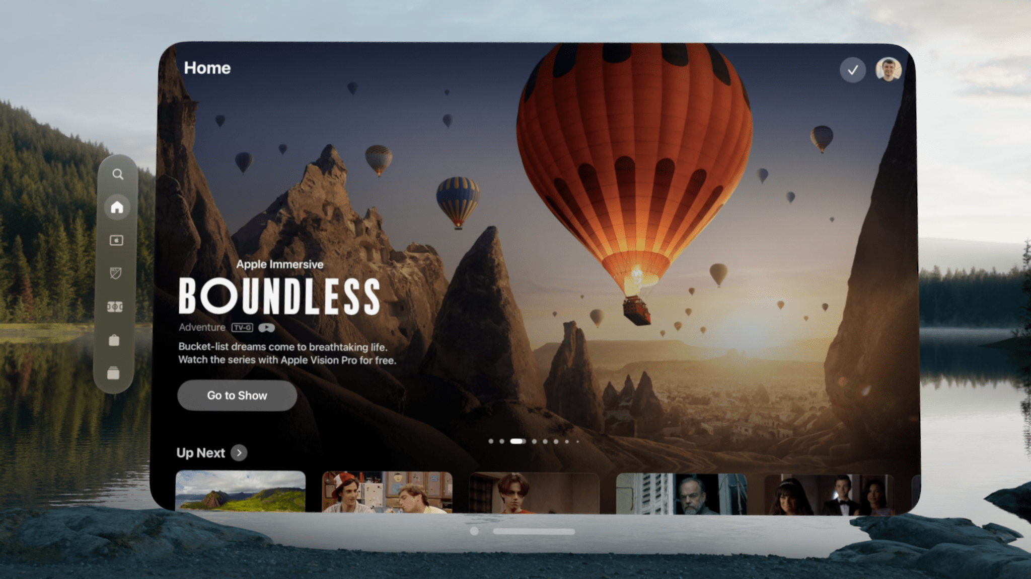
Speaking of cinematic experiences, Vision Pro is already the ideal way to watch films with its support for 4K, high dynamic range, 3D, spatial audio, and variable frame rates.8 It’s also the only place to experience Apple Immersive Video, the company’s 8K, 3D, 180-degree video format behind titles like Boundless and Prehistoric Planet Immersive, which is receiving a couple of updates this year.
You can now minimize immersive videos from full-screen view into a window. This allows users to enjoy the content without being fully immersed in it, and it’s also an alternate way to observe the 3D effects within the content.
On the accessibility side, captions can now be repositioned while watching immersive videos. Unlike traditional content, immersive video does not have a fixed point of view, and there’s action happening on all sides. That’s why it’s important that viewers who rely on captions be able to place them in whatever position works for their personal viewing needs and preferences. I’m thankful that Apple is continuing its work to ensure that spatial computing and immersive content are accessible to everyone.
The ‘Dim Flashing Lights’ setting is now available on visionOS as well. This is an important accommodation that was first added to the Apple TV last year, and it’s good to see it come to Vision Pro.
The TV app for visionOS will be adding support for Multiview later this year, allowing viewers to watch multiple sporting events at the same time. I’m a big fan of Apple’s Multiview implementation on Apple TV and iPad with easy source and layout switching, so I’m interested to see how this looks when it becomes available. I’m also curious to see when InSight, the feature that displays real-time information about actors, characters, and music onscreen, will come to visionOS after its launch on tvOS, iPadOS, and iOS this year.
Messages
Dictating a message, no pinch required.
While Messages on visionOS 2 doesn’t include text effects or message scheduling like other platforms, it does add emoji Tapbacks and RCS support alongside a visionOS-exclusive feature this year: Look to Dictate. This option was previously available for Safari’s search bar and other search fields, but it’s now coming to the Messages composition field as well. Just look at the microphone icon to enter dictation mode and start speaking without the need to pinch your fingers together.
Mindfulness
The most relaxing thing you’ll see today – now synced to your breath.
The Mindfulness app is one of the coolest experiences available on Vision Pro. It’s a true reimagining of what a meditation tool can be in an immersive environment. I find the digital petals floating around me to be both soothing and centering when it’s time for me to meditate. In visionOS 2, the movement of the petals and associated sounds can now be synced to your breath thanks to the new ‘Follow Your Breathing’ setting.
I don’t recommend replicating this experiment, but I tried enabling the feature and holding my breath during a meditation, and the animation held steady, waiting for me to exhale before starting its next motion. While I personally find that I benefit from a bit of guidance on my breathing rate when meditating, this is a good option for those who breathe more slowly or quickly than the predetermined guide and want the app to match their rhythm.
Developer Tools
Typically, a review like this one focuses exclusively on user-facing features, not behind-the-scenes tools for developers that users won’t ever use or potentially even recognize. In the case of visionOS 2, though, I think it’s worthwhile to point out a few new frameworks and APIs being made available to developers this year because they represent the evolution of the platform and the direction Apple believes spatial computing is headed. These additions aren’t necessarily things you’ll find in operating system feature lists, but they set the foundation for new types of apps and experiences in visionOS that will be important for the platform’s future.
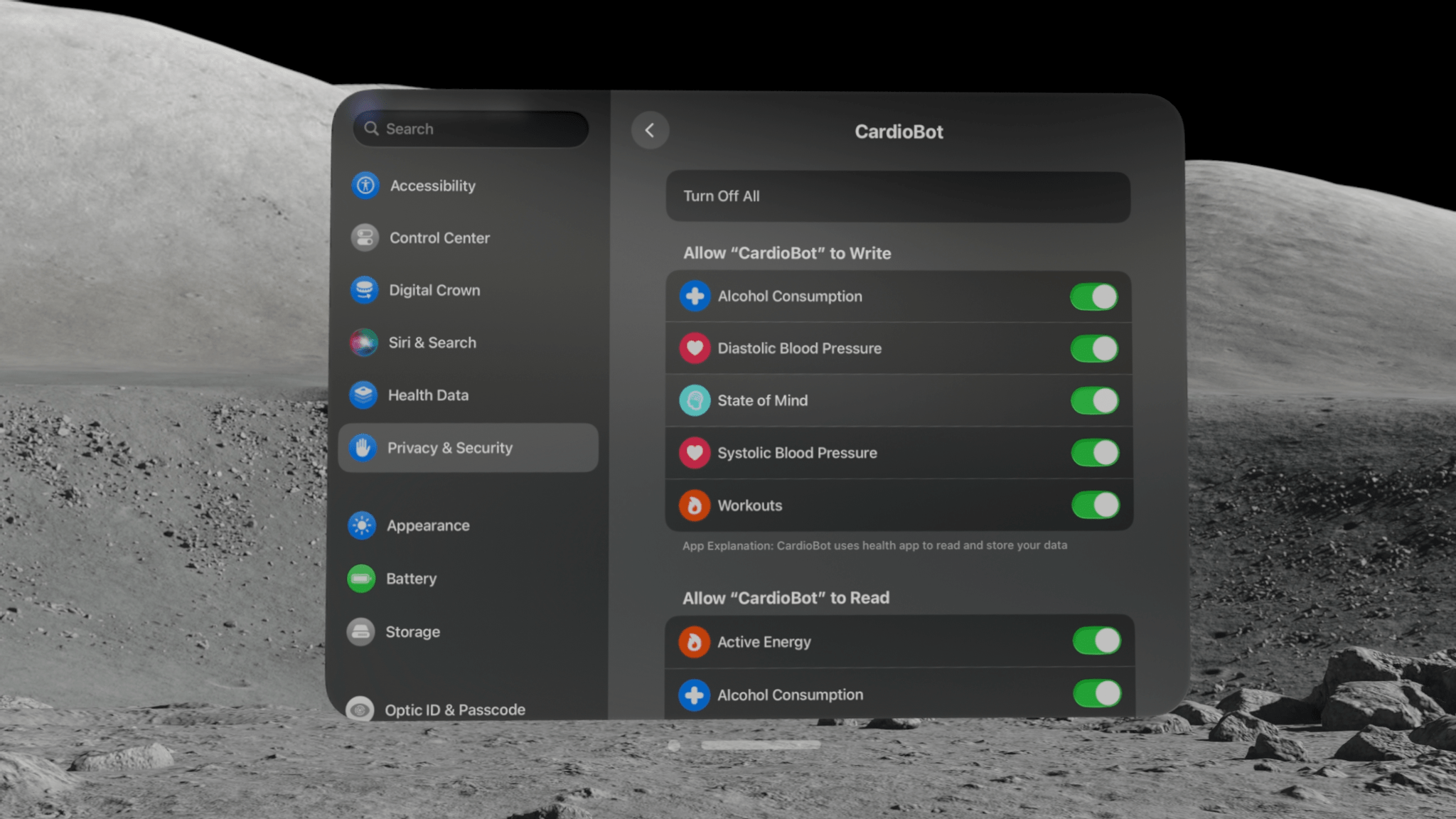
HealthKit has made its way to visionOS.
I didn’t expect HealthKit to come to visionOS so quickly based on how long it took Apple to bring the feature to iPad, but I’m pleasantly surprised that it’s coming in visionOS 2. Now, apps on Vision Pro can request users’ permission to access, display, and update their health data. This makes the platform more viable for developers of health- and fitness-focused apps. I hope to see more apps in these categories in the Vision Pro App Store soon.
Apple isn’t taking the lead in these categories on the platform, though. Neither the Health app nor the Fitness app are included in visionOS 2, which is a shame. This lack of first-party apps in the health and fitness categories could be an opportunity for third-party developers to fill the gaps and create compelling experiences that entice new users.
Developers can now set the position of new apps windows when they appear, an improvement over the previous sytem that always opened windows directly in front of the user’s gaze. Windows placement can be set relative to existing windows in the space or relative to the user. A new option called ‘push window’ allows an app to open a new window in the place of an existing one, covering up the original window. New window controls may not be the most exciting addition to an operating system, but these options empower developers to create more tailored experiences for users of their apps, which is always a good thing.
The majority of the new developer tools in visionOS 2 pertain to augmented reality. Room tracking lets developers know when a user enters a new room, and apps can respond accordingly.9 The system is now capable of detecting not only horizontal and vertical surfaces, but slanted ones as well, giving developers a fuller understanding of the space around the user. Volumetric apps can be opened alongside other apps, and they can be resized, tilted, and customized with ornaments.
Apple’s virtual teacup looks great next to my Stanley.
Virtual objects can be attached to physical surfaces within a room, too. I was able to test this feature by opening a USDZ file for a 3D object in Quick Look and moving it around the room. As you move an object close to the level of a table or the floor, it will snap to that surface with a satisfying clicking sound. Then, you can slide that object around the surface and put it exactly where you like.
Once an object is in place, it does not move at all. You can walk around it, look away from it then back, and even leave the room and come back later, and the object will stay precisely in place no matter what. It truly is remarkable how stable these virtual objects are, and it makes them feel integrated with the physical world in a much deeper way than was possible before. Apps that place virtual objects within the user’s environment will be able to give much more realistic impressions thanks to these improvements.
Meanwhile, new object tracking APIs allow developers to use physical objects as anchors for virtual elements. Imagine buying a physical product that comes bundled with a visionOS app for augmenting and interacting with it, or an app that identifies objects within your space and lets you select them to learn more about them. These are the kinds of experiences made possible by object tracking, and I’m excited to see how developers put these tools into practice.
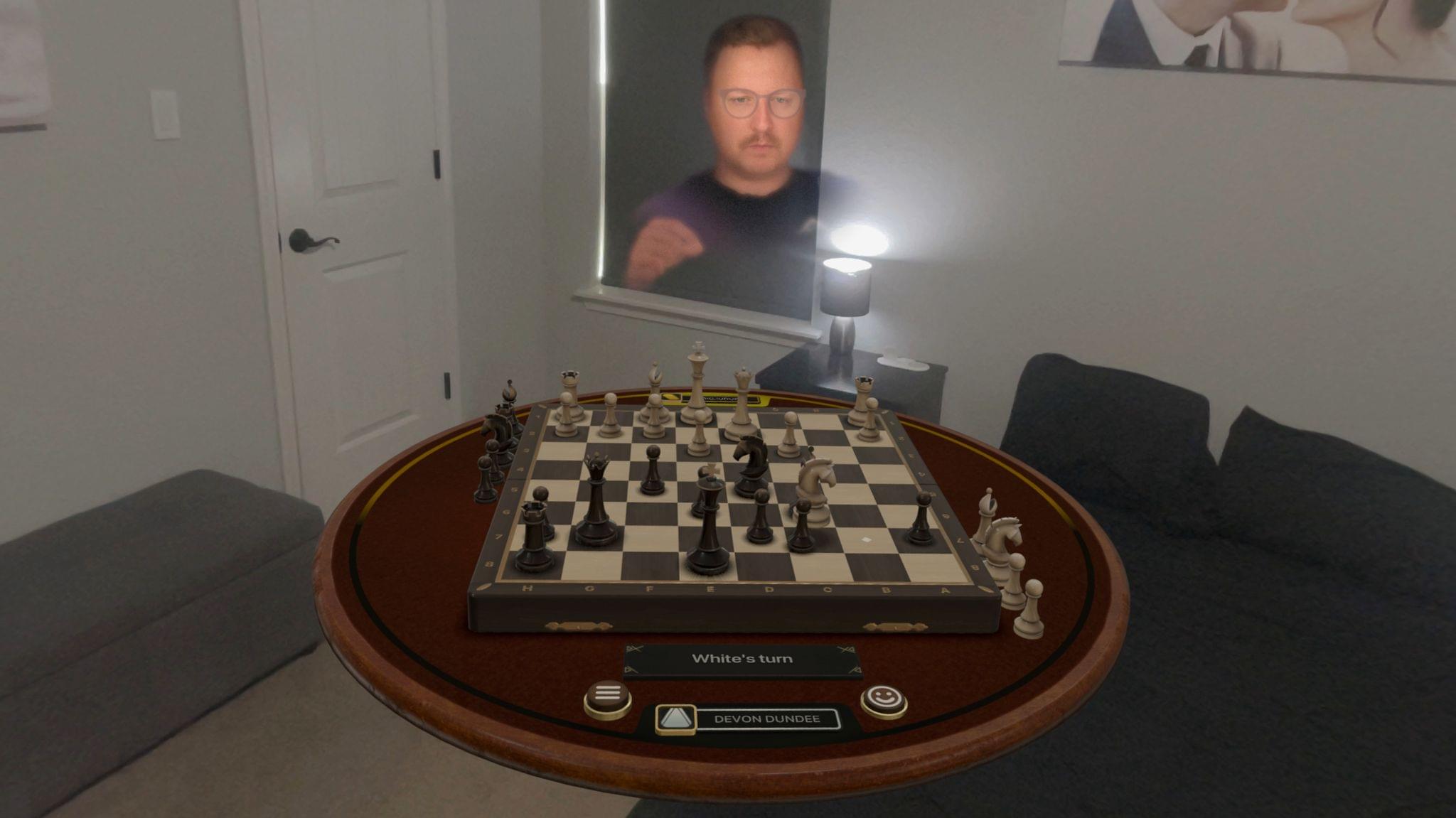
Playing Chess with Sigmund in Game Room.
TabletopKit makes it easier for developers to create spatial experiences based around a table. One of the coolest things I’ve ever done with my Vision Pro is playing board games with a friend in Game Room from Resolution Games via SharePlay. It does an incredible job of replicating the experience of sitting across from someone while playing a tabletop game together, and TabletopKit will enable more developers to create experiences like this. Apple featured indie game studio GRL Games’ upcoming title Haunted Chess in the WWDC keynote as an example of TabletopKit in action. I hope to see a lot of these types of games available on the platform before long.
These new developer tools follow the same pattern as the user-facing quality-of-life improvements in visionOS 2: they seem like table stakes10 in a vacuum, but when considered within the short history of visionOS, they represent a rapid pace of change in response to users’ experiences and developers’ needs. Together, they form a more complete foundation for building spatial computing applications that in turn offer more immersive, enjoyable, and beneficial experiences for users. A feature like room tracking might not seem like such a big addition now, but it will likely be considered an essential element of spatial computing in the future. And thanks to these new tools and the developers implementing them, that future starts now.
What’s Next?
That’s what’s new in visionOS 2 this year. But before we go, I’d like to consider what’s next for the platform. Really, I’d like to share my personal wishes for the future of visionOS. I have several, and many of them are big asks, but given how much has changed in visionOS over its short lifespan so far, I expect that at least some of these requests will be checked off the list when visionOS 3 ships, presumably next fall.
Here’s what I’d like to see come next:
Improved multitasking: Putting together multi-window setups in visionOS by adding windows one at a time from the Home View, Spotlight, or Siri is too cumbersome and time-consuming. Even once a setup is perfect, you have to tear it all down when moving on to the next task. I want a spatial computing version of Stage Manager that allows me to create a series of multi-window views and easily switch between them. A quick launcher or dock hidden behind a hand gesture would be a great way for launching often-used apps, too.
A more robust notification system: visionOS doesn’t handle notifications well. They appear as tiny icons at the top of the user’s view that indicate nothing more than the app sending the notification. You have to tap on a notification in order to get any useful information from it, and then there’s no way to act on the notification other than to open its associated app. I’d like more information available within the notification itself, possibly by expanding the tiny icon into a larger element when the user looks at it, as well as the ability to quickly act on notifications, such as by replying to messages inline. Notification Center needs some attention, too, as the horizontally scrolling list can become a jumbled mess in no time.
Native system apps: I was surprised that no system apps were migrated from their iPad versions to native visionOS apps with the release of visionOS 2. The ability to run iPad apps on Vision Pro is a necessary feature, but Apple shouldn’t rely on it to avoid creating native versions of each of its apps. No one thinks the iPad version of Podcasts offers as good of an experience on Vision Pro as the native Music app. The company should show its commitment to the platform by getting every first-party app out of the Compatible Apps folder as soon as possible.
Core experiences reimagined for spatial computing: Once all of Apple’s apps are running natively on visionOS, it’ll be time to start rethinking many of them in light of what Vision Pro can do. Spatial computing is a new way of interacting with software, so every system app shouldn’t be limited to the flat rectangles that came before. How about a 3D virtual desk calendar showing your events for the day? Or a virtual recreation of the book you’re reading that you can hold in your hands? An envelope to fold your email into before sending it?11 The possibilities are endless in visionOS, and I’d like to see Apple think outside the literal box.
Feature parity with other Apple platforms: As far as visionOS has come, it’s still missing some features that we take for granted on other platforms: things like widgets, Find My support, Focus filters, and personal automations in Shortcuts, to name a few. That’s not to mention the fact that Apple Intelligence hasn’t been announced for visionOS at all, even as it’s poised to be released on iOS, iPadOS, and macOS later this year. Based on its prominent placement in the WWDC keynote and the fact that it’s being brought into the regular software development cycle, visionOS seems to be a high-priority platform for Apple, and it deserves the full platform treatment.
Incentives for third-party developers: The visionOS App Store continues to grow, but it’s nowhere near the size of the App Store on iOS or even iPadOS. Too many developers are opting out of developing for the platform or even allowing their iPad apps to run on it, and it’s up to Apple to convince them. I can’t say for certain what that looks like, and I imagine it won’t be a one-size-fits-all approach, but I want to see more third-party software available for Vision Pro, including some of my favorite apps that I currently have to use via AirPlay Receiver or Mac Virtual Display.
More devices running visionOS: This is actually a hardware request, and it’s almost definitely one that won’t be addressed within the next year. But the reality is that Vision Pro – as incredible and groundbreaking as it is – is not a product that appeals to the masses in terms of form factor or pricing. For spatial computing to grow, visionOS will need to be offered on a range of products with a much broader market in mind. Vision Pro is a feat to be sure, but at the same time, it’s likely the biggest, heaviest, and least comfortable device that will ever run visionOS. That presents a huge but exciting challenge for the hardware engineers working on the next Vision product, and I hope they meet that challenge with an offering that will be appealing and attainable to a wider swath of people.
Conclusion
Fifteen months after the Vision Pro was first announced, the product has already been on a wild ride full of twists and turns, the latest of which is visionOS 2, a major upgrade to the device’s operating system that’s barely half a year old. In that short time, the visionOS team has put together a substantial update with a compelling batch of features: quality-of-life improvements that users will benefit from constantly, integration with iOS and iPadOS to make more apps accessible on the platform, developer tools that firm up the foundation of spatial computing, and a jaw-dropping photo-viewing experience that only Vision Pro can offer. This is an update worthy of the 2.0 label, and I continue to be surprised at how much the platform has developed in such a short time.
The thing that excites me most about visionOS 2 is the way it represents how early we are in the era of spatial computing. Foundational principles still aren’t completely set in stone, and Apple is working with users and third-party developers to understand how this new paradigm for computing is going to work. Free of the baggage of legacy form factors and with so many uses cases unexplored, the possibilities are endless, and we get a front row seat to the discovery process.
What we’re seeing is a new way of computing being shaped before our very eyes. It’s going to take some time for spatial computing to reach its full potential, and the first attempt at some aspects won’t always be the right one. Things might even get a little weird. But until the system matures into yet another fully baked platform that prioritizes stability over innovation, we get the privilege of seeing it try new things, figure out what works and what doesn’t, and grow into what it will become.
visionOS 2 is a step forward in the journey of spatial computing. There’s a long way to go, but where we’re at is pretty great, and I, for one, am happy to be along for the ride.
Special Thanks
I consider it an incredible honor to get to write and publish this MacStories review covering a platform I believe in and enjoy deeply. Thank you so much for taking the time to read it. This project wouldn’t have been possible without the support of some wonderful people, so I’d like to thank a few in particular:
- My wife Katherine, who is the most amazing partner and pushes me to pursue my dreams, including this one.
- My son Noah, my inspiration for trying to make the world a little better in my own nerdy way.
- Federico and John, for giving a guy with zero professional writing experience a chance to be a part of the incredible team they’re assembling.
- The rest of the MacStories team, whom I endlessly enjoy working with every day.
- Sigmund Judge, my podcasting partner in crime and consistent go-to for bouncing around ideas.
- Tim Chaten, for never saying no to nerding out about Vision Pro with me.
- Indie app developers, who create tools that improve my life and inspire me to create.
- Joseph Simpson, for generously sharing developer perspective on visionOS.
- The Vision Pro team at Apple, for their incredible work on this release and for blazing the trail of spatial computing.
- Magic Rays of Light listeners.
- Club MacStories members.
- Our Discord members, for having such interesting conversations I always learn from.
And once again, a huge thank-you to MacStories readers like you for supporting our work and being so welcoming to me as I joined the team this year. This community is amazing, and it’s a privilege to be a part of it.
- Multitasking is another ongoing issue in visionOS, and version 2 doesn’t change much on this front. We’ll talk more about this topic in a bit. ↩︎
- I had given up on playing Jetpack Joyride 2 on my Vision Pro due to so many games being interrupted by the Control Center caret until this tip from Federico helped me limit unintended activations. Moving the caret further up made it harder to use when I wanted to, though, so it still wasn’t an ideal solution. ↩︎
- Pixels? ↩︎
- This was the first improvement I noticed after installing visionOS 2, and it was immediate. I literally said out loud, “My hands look awesome!” ↩︎
- Videos, by the way, can be trimmed in the Photos app in visionOS 2. I didn’t realize this capability was missing until Apple announced it as a new feature. ↩︎
- The Photos app does offer a limited selection of automatically converted pictures in the Featured Spatial Photos collection. I find this collection delightful to browse, and it gives me hope that more automatic conversion options are possible. ↩︎
- Alas, visionOS does now remain the sole Apple platform without a built-in calculator app. ↩︎
- The platform could still win some extra points with film buffs, though, by adding support for watching iTunes Extras bundled with film purchases and giving users a path to upgrade 2D titles imported from other storefronts via Movies Anywhere to 3D. ↩︎
- The example use case Apple gives for this technology is a virtual pet that abides within a particular room and greets you when you enter it, and I want to buy this app immediately. I really hope there’s a developer out there working on it. ↩︎
- Pardon the pun. ↩︎
- Okay, maybe not that last one. Email’s enough of a chore as it is. ↩︎
Support MacStories and Unlock Extras
Founded in 2015, Club MacStories has delivered exclusive content every week for over six years.
In that time, members have enjoyed nearly 400 weekly and monthly newsletters packed with more of your favorite MacStories writing as well as Club-only podcasts, eBooks, discounts on apps, icons, and services. Join today, and you’ll get everything new that we publish every week, plus access to our entire archive of back issues and downloadable perks.
The Club expanded in 2021 with Club MacStories+ and Club Premier. Club MacStories+ members enjoy even more exclusive stories, a vibrant Discord community, a rotating roster of app discounts, and more. And, with Club Premier, you get everything we offer at every Club level plus an extended, ad-free version of our podcast AppStories that is delivered early each week in high-bitrate audio.
Join Now